Bringing a splash of colour and seamless user experience to a Swedish institution

Kids’ perspective = revolution
Unga Klara is one of the world's most experienced and progressive theaters targeted towards both children and young adults. Together, we created a flexible and user-friendly website that would meet their needs online for years to come.
The challenge
The website required a fine balance between both their vibrant, creative identity and the demands of a clear and flexible user experience. The key was a robust, modular information structure – with creative visual elements that are customised to suit each production.
The result
We developed the concept, user experience, digital design and code. Visit the website at ungaklara.se.
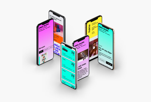
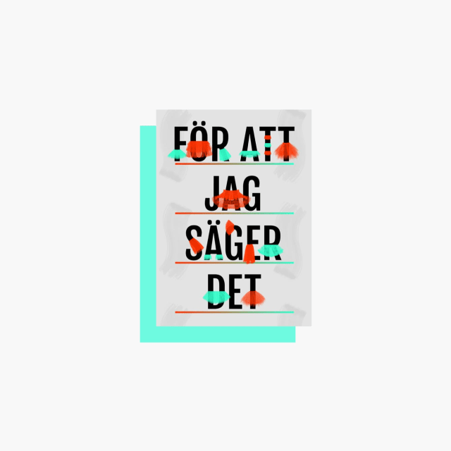
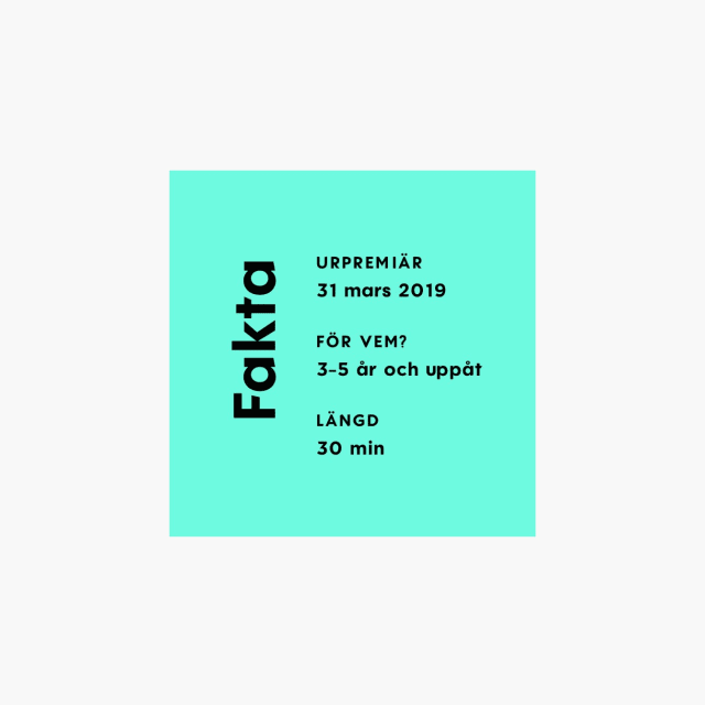
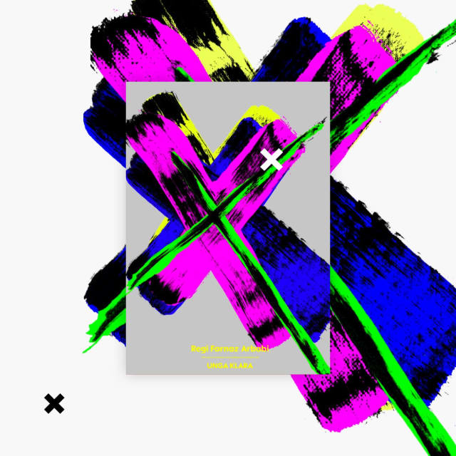
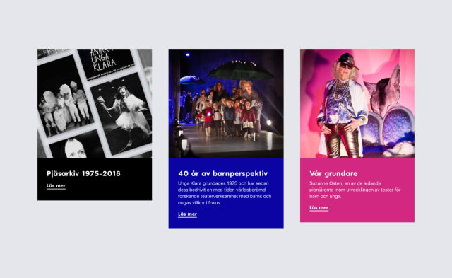
Cohesive visual expression. When Unga Klara produces a new show, the scenography, costume and posters are all linked together thematically. Of course, the website should follow suit. For this to be possible without spending time coding each page individually for each new production, the site was coded so that a unique color theme could easily be selected to run throughout the page. Together with graphic elements from the show posters, each page then falls in line with the vibe of the art direction.





Shifting focus – from us to you
From visitor data, we understood that the majority of people visited ungaklara.se to learn quickly about the specific shows and to book tickets. Naturally, the focus fell on enhancing that experience and to communicate the unique character of each and every production.
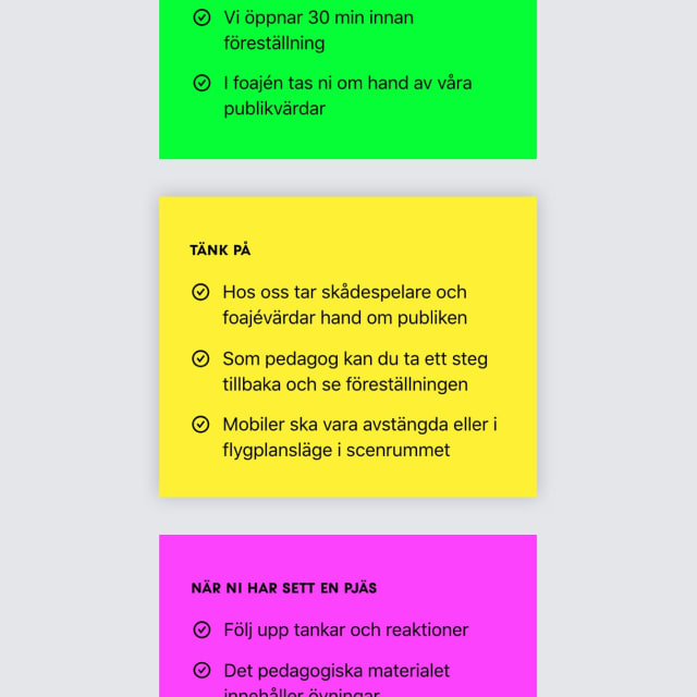
We developed custom editorial tools and a modular toolbox to allow the site to scale as needed. Editors can create rich pages that adapt to a broad variety of content, but also create concise and elegant pages if faced with smaller topics or limited content.





It's in the details
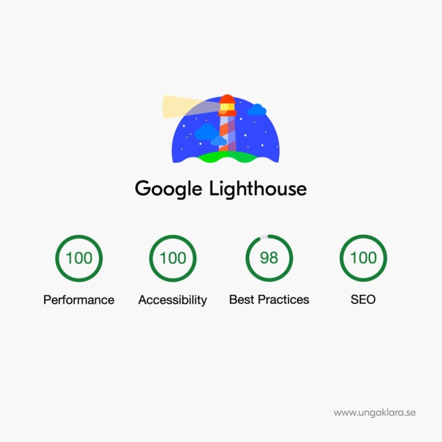
An important part of creating the website was to make it accessible for everyone, regardless of physical or mental ability. With the value of accessibility at its core, smart UX, clever code and repeated user-testing informed our process. The website also ended up lightning fast – even if your internet connection isn’t.

